

The rule of thirds is a simple grid method that helps tradesmen place fixtures, lighting, and joinery so a finished room looks balanced rather than accidental. Divide any wall or surface into nine equal parts and position key features on the crossing points, working inside UK compliance limits at all times.
That short answer is the whole idea in one paragraph. The rest of this guide shows how it works on site, where it applies to real trade decisions, and how to combine good composition with UK building standards so the result is both attractive and safe.
What the Rule of Thirds Actually Means
The principle divides any surface, wall, or plan into nine equal parts using two horizontal and two vertical lines, like a noughts and crosses grid. The four points where those lines cross are the natural focal positions. Placing key features on or near these intersections, rather than dead centre, produces a layout that feels comfortable and deliberate.
For a decorator, that might mean positioning a feature panel so its edge follows a vertical third line. For a kitchen fitter, it can guide where a run of pendant lights lands over an island. The grid is a proportional starting point that keeps decisions consistent across a whole project.
Why It Matters for Tradesmen, Not Just Designers
On many jobs the designer hands over a concept, but the trade professional makes the hundreds of small placement calls that decide whether that concept survives on a real wall. Socket heights, tile setting-out, splashback centring, shelf spacing, and radiator positioning all benefit from a shared visual logic.
Using this method gives you clear benefits on site:
- Defensible decisions: You have a sound reason for your setting-out when a client or main contractor questions it.
- Less rework: A considered layout is less likely to be ripped out and repositioned late in the programme.
- Better portfolio: Well-composed rooms photograph well and win recommendations.
- Quality control: Good composition is, in practice, a repeatable form of finish quality.
Applying the Rule of Thirds Room by Room
Walls and Feature Surfaces
When setting out panelling, a feature wall, or large-format tiling, picture the third lines running vertically across the wall. Aligning breaks, joints, or a change of finish to those lines avoids the awkward look of a feature stranded in the middle. Sensible tile setting-out that also respects these proportions helps you avoid thin, unsightly cut tiles at the edges.
Lighting Placement
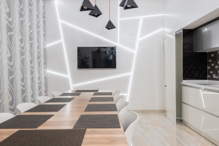
Lighting responds well to compositional thinking. A row of downlights or pendants positioned along a third line often looks more deliberate than a centred run. Aesthetics never override the electrical requirements, though. Key points to hold onto:
- Wiring standard: All fixed wiring and lighting must comply with BS 7671, the IET Wiring Regulations, which apply UK-wide.
- Notifiable work: In England, certain domestic electrical work is notifiable under Part P of the Building Regulations, and separate regimes apply in Wales, Scotland, and Northern Ireland.
- Order of priority: Composition only chooses the best-looking position from the safe, compliant options. It never dictates a position that breaches the regulations.
Joinery, Shelving, and Storage
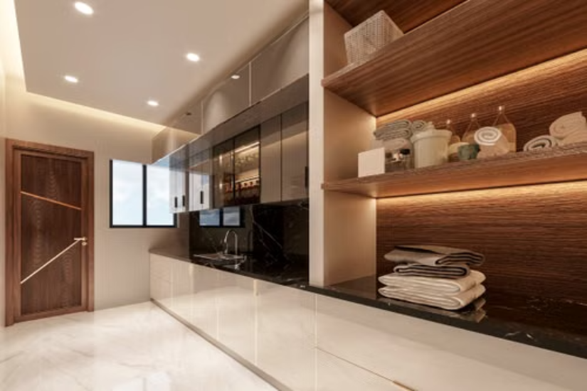
Fitted furniture reads better when shelf spacing and cabinet proportions echo a thirds relationship rather than being split evenly. A tall unit divided into thirds, with heavier storage low and lighter display high, tends to feel more grounded. This mirrors long-standing proportional systems used in cabinetmaking.

Windows and Sightlines
Where you have freedom over blinds, curtain poles, or shutters, aligning the top of the treatment or the split of a shutter to a third line strengthens the composition. Natural light is a design asset, and good daylighting is linked to occupant wellbeing, a factor increasingly reflected in UK design guidance.
Combining the Rule of Thirds With UK Standards
Composition and compliance are not in conflict, but compliance always comes first. A few reference points are worth building into your workflow:
- Building Regulations (Approved Documents): These cover structure, fire safety, ventilation, and accessibility in England, with separate equivalents in Wales, Scotland, and Northern Ireland.
- Part M (access to and use of buildings): Fixture heights and clearances for accessibility are prescribed and take priority over any visual preference.
- Part P (electrical safety, dwellings): Governs domestic electrical work in England and who may carry it out.
- BS 7671 (IET Wiring Regulations): The core UK-wide standard for the design and installation of electrical systems.
The disciplined approach is simple. Establish the compliant zone for any element first, then use good composition to choose the most effective position inside that zone. This keeps you both safe and sharp.

A Simple On-Site Method
You do not need special equipment for this. A practical routine looks like this:
- Measure the surface or plan area you are working on.
- Divide the width and height into thirds and lightly mark the four crossing points.
- Confirm the compliant positions for services, fixtures, and clearances.
- Place the main focal feature on or near a crossing point that also satisfies compliance.
- Arrange secondary elements to support, not compete with, that focal point.
Over time this becomes second nature, and you will start to see the grid without drawing it.
Common Mistakes to Avoid
A few habits undermine good composition on site:
- Centering everything: This is the most frequent error and tends to make rooms feel static.
- Forcing the grid: Where symmetry is genuinely right, such as a formal fireplace wall, do not fight it.
- Chasing looks over safety: Never let composition tempt you into non-compliant fixture heights or unsafe electrical positions.
Treat the principle as a guide, not a law, and let the regulations set the hard limits. Build your trade skills with TradeFox and practise the practical techniques that help you work safely, accurately and with greater confidence on site.
Why This Skill Pays Off
Clients rarely have the words to explain why one finished room feels better than another, but they feel it, and they pay for it. Mastering this method gives tradesmen a quiet edge: cleaner setting-out, fewer callbacks, and spaces that photograph well for your portfolio. For anyone building a reputation in interiors, that visual literacy is as valuable as the manual skill itself.
Composition is learnable, repeatable, and fully compatible with working to standard. Layer it onto your existing trade knowledge and you raise the quality of every room you touch.