


Colour balance is what separates a professional finish from an amateur one. Clients rarely have the words to explain why a room feels wrong, but they know it when they see it. Most of the time the problem is proportion, and this is where the 60 30 10 rule earns its place in a decorator’s kit. It gives you a dependable way to spread colour across a space, and once you learn to bend it rather than follow it blindly, your work stops looking like it came off a production line.
This guide is written for painters, decorators, and anyone training towards the trade. It covers what the rule is, how to apply it on a real job, where it stops being useful, and how to keep schemes feeling considered rather than mechanical.
What the 60 30 10 Rule Actually Means
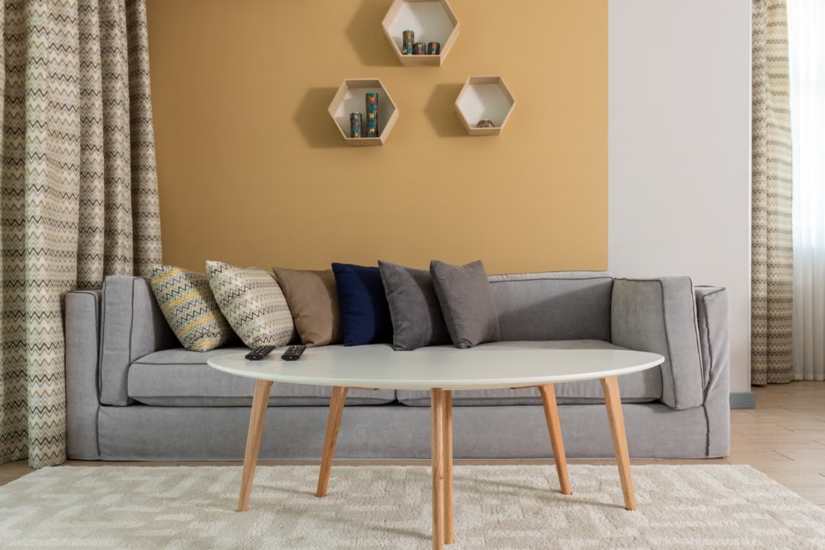
The 60 30 10 rule is a proportional guide for splitting colour within a room across three roles. Sixty per cent carries the dominant colour, thirty per cent carries the secondary colour, and ten per cent is the accent. The maths is not meant to be exact. Nobody measures surface area to the decimal point. The ratio is a mental model that keeps one colour in charge, one in support, and one for punctuation.
On a typical interior it usually breaks down like this:
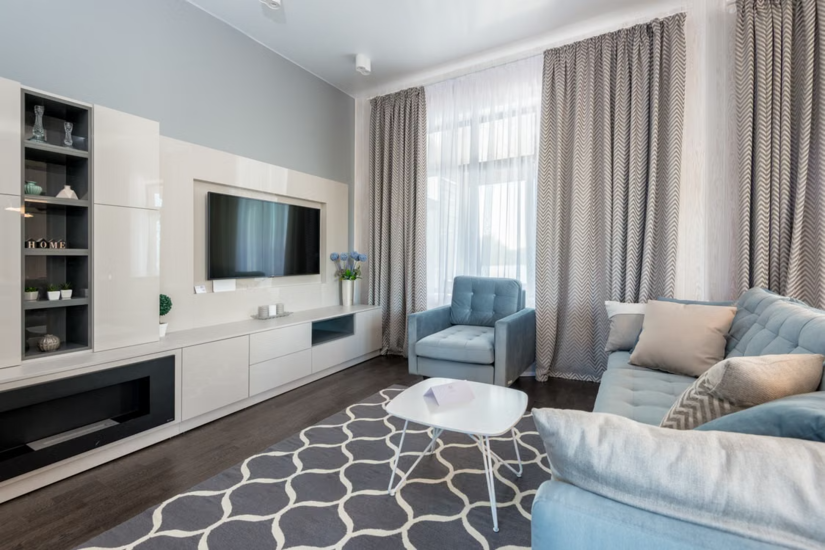
- Dominant, sixty per cent: Walls, large rugs, and the main flooring tone. This is the backdrop the eye rests on.
- Secondary, thirty per cent: Upholstery, curtains, cabinetry, or a feature wall. It supports the dominant colour without competing with it.
- Accent, ten per cent: Cushions, artwork, hardware, lamps, and trims. This is the sharpest colour, and it stops the scheme from falling flat.
Why the Rule Works
The human eye needs a hierarchy. When two or three colours fight for the lead, a room reads as busy and unresolved. When one colour is clearly in charge, the space feels finished. This proportional thinking is why manufacturers such as Dulux Trade and Farrow & Ball lean on the same logic in their trade guidance.
For anyone building a decorating business, being able to explain this to a client is worth money. It turns a vague chat about “what goes with what” into a structured recommendation you can stand behind on site.
Applying the Rule on a Real Job
Start with the fixed elements. On most refurbishments you inherit flooring, fitted cabinetry, or furniture the client is keeping. Work out which of these will act as your dominant sixty per cent before you open a single tin.
Then work outward:
- Lock in the dominant colour first: Large expanses of saturated colour become overwhelming, so neutrals and muted tones usually do the heavy lifting on walls. When you need to specify or match paint accurately for a contract, the BS 4800:2011 colour range gives you a recognised reference that clients and main contractors understand.
- Choose a secondary that shares an undertone: The thirty per cent should feel related to the dominant colour. A warm grey wall sits comfortably with a deeper taupe or a soft green that shares the same warmth in its base.
- Add the accent last: Because the ten per cent covers so little area, you can be bold with no real risk. This is the colour the client remembers, so choose it on purpose rather than as an afterthought.
A common slip among those newer to the trade is treating the accent as leftover. It is the opposite. The accent does most of the work for character, so it deserves the most thought.
How to Keep Schemes From Looking Formulaic
Here is the part most guides skip. Applied rigidly, the rule turns out rooms that look like every show home on the estate. Clients paying for skilled work want something that feels like theirs. These adjustments keep the balance intact while putting the personality back.
Split the Accent
Instead of one ten per cent accent, break it into two colours at roughly seven and three per cent. Two accents from the same tonal family add depth without upsetting the overall hierarchy.
Work With Tone, Not Just Colour
The rule talks about colour, but strong finishes rely heavily on tonal variation within a single hue. Three shades of the same green across walls, joinery, and accessories can satisfy the proportional logic while looking far richer than three separate colours.
Vary Texture and Finish
The same colour reads completely differently in matt versus eggshell, or in fabric versus painted timber. Texture lets you keep the palette tight while adding interest, and that is often what stops a scheme feeling flat.
Let the Architecture Lead
An older property with cornicing, picture rails, and deep skirting gives you natural homes for the secondary and accent colours. Following the building’s own features produces a result that feels bespoke rather than imposed.
Common Pitfalls to Avoid
Even a sound scheme can be undone by a few predictable mistakes:
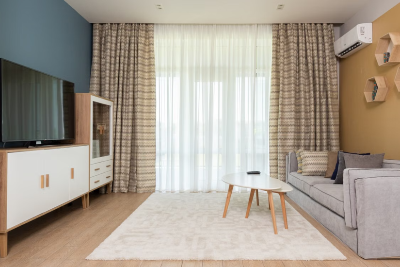
- Overloading the accent: Push the ten per cent towards twenty or thirty and the hierarchy collapses. The room loses its focus.
- Ignoring the light: North-facing rooms cool colours down and south-facing rooms warm them. Assess samples in the actual room at different times of day before committing, and get the client to do the same.
- Forgetting the ceiling and floor: These are large surfaces that count towards your proportions. A dark floor is doing dominant-colour work whether you planned it or not.
- Matching too closely: Colours that sit almost on top of each other muddy the scheme. Handled well, contrast is what makes the balance readable.
Where the Rule Does Not Apply
The 60 30 10 rule suits homes and most commercial fit-outs, but not every colour decision is a design choice. Some colour on a job is set by regulation and must never be treated as decorative.
The clearest example is safety and fire-safety signage. Under the Health and Safety (Safety Signs and Signals) Regulations 1996, safety signs follow standardised colours, shapes, and symbols, with BS EN ISO 7010 setting out the graphical symbols and safety colours used. Pipework identification under BS 1710 works the same way, with set colours carrying set meanings. For anything like this you work to the relevant standard and the client’s specification, not a design ratio.
It is also worth clearing up a common misunderstanding on site: there is no colour code for fire doors. A fire door’s compliance comes from its fire rating, certification, and correct installation under the Regulatory Reform (Fire Safety) Order 2005, evidenced against test standards such as BS 476-22 or BS EN 1634-1. The decorative colour you paint it makes no difference to that. What is regulated is the signage around it, not the paint on it.
Good decorating takes more than choosing colours. It takes practice, judgement and an understanding of how finishes work together. TradeFox helps painters and decorators build practical skills through simple, interactive training they can work through at their own pace.
Building the Skill
Colour confidence comes from repetition and from studying finished work with a critical eye. A few practical routes help:
- Trade bodies: The Painting and Decorating Association offers training and resources aimed squarely at the trade.
- Manufacturer schemes: Trade colour cards, undertone guides, and CPD material from the major paint makers sharpen your judgement over time.
- Formal qualifications: CITB-recognised decorating routes cover colour theory as part of wider competence.
The 60 30 10 rule is a starting framework, not a rulebook. Learn the proportions first, then learn where to break them. That mix of structure and judgement is what clients pay a skilled decorator for, and it is what keeps your finished rooms balanced without ever looking formulaic.