

Bold colour is back on the job sheet. Clients who spent the last decade asking for greige and brilliant white are now handing painters and decorators mood boards full of clashing brights, saturated feature walls and colour-drenched rooms. The trend has a name, and if you work in interiors you need to be fluent in it.
This guide breaks the trend down for working trades and for people training toward the trade, not for DIY weekend jobs. The difference matters, because a professional finish in strong colour is far less forgiving than it is in neutrals.
What Dopamine Decor Actually Means
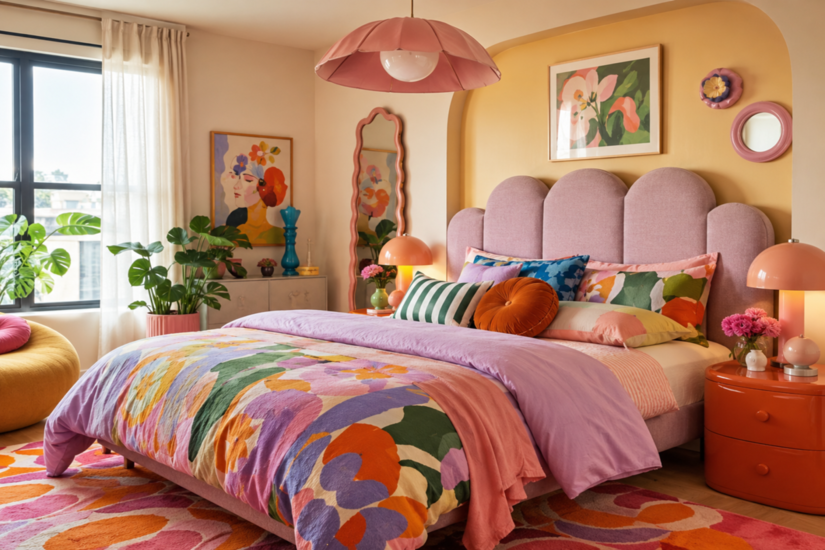
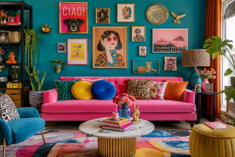
Dopamine decor is an interior design approach that puts emotional response ahead of neutrality. The name borrows from the brain’s reward chemistry: the idea is that colour, pattern and texture can lift mood, so a room is decorated to make the occupant feel good rather than simply to follow a safe visual rulebook. It moved from social media into mainstream design and has held on because joy does not go out of fashion.
For your purposes, the key point is this: the look is not the same as “paint everything bright.” Strong schemes are defined by balance and sensory response, not by saturation alone. Colour is the headline tool, but texture, contrast and proportion are what keep a room from tipping into chaos. A client who wants the look but ends up with a jarring, restless space has been given colour without control. Your job is to supply the control.
Why Trades Need to Understand the Trend
Two things are happening at once:
- Demand for strong colour work is rising, which is good news for anyone offering decorating services.
- Clients are far more confident talking about how they want a room to feel, so they push for choices that look risky on paper.
If you can explain why a scheme will or will not work, you win the job and you protect yourself from callbacks. A decorator who says “that will look busy” loses the argument. A decorator who says “we can keep the two brights you love, but hold them to a 60-30-10 split so the room still reads calm” keeps the client and gets recommended.
The Rules That Keep Bold Colour From Reading as Chaos
Use Proportion as Your First Control
The most reliable structure is the 60-30-10 rule: roughly 60 percent dominant colour, 30 percent secondary and 10 percent accent. It is a heuristic, not a law, but it does the heavy lifting. Chaos almost always comes from too many colours fighting at equal strength. Give one colour the room, let a second support it, and reserve the loudest hit for accents such as joinery, a single wall or accessories.
Anchor Bold Colour With Neutrals and Texture
Saturated colour needs somewhere for the eye to rest. Pairing a strong hue with a warm off-white, natural timber or textured plaster stops the scheme feeling relentless. Texture matters as much as tone:
- Matt finishes absorb light and soften a colour down.
- Higher sheens reflect light and make the same shade read brighter and more active.
Choosing the right finish is part of the design, not an afterthought.
Respect UK Light
British homes have a specific problem. The UK has some of the lowest winter daylight levels in Europe, and orientation changes everything. A north-facing room, a deep-plan space or a basement will flatten and cool a colour. The same tin of paint can look joyful in a south-facing kitchen and grim in a north-facing box room.
Always test a large sample in the actual room and review it in morning, afternoon and evening light before committing. Small colour chips tell you almost nothing once a shade covers a whole wall.
Use Colour Drenching and Colour Capping Deliberately
Two techniques give bold colour a considered look:
- Colour drenching takes a single strong shade across walls, ceiling and woodwork so the room feels immersive rather than patchy.
- Colour capping carries a tone up over the ceiling, which can add drama and a sense of height, especially if you lift the ceiling sheen slightly to bounce light.
Both are ways to be bold without being chaotic, because a single colour used fully reads as intentional where three scattered colours read as accident.
Getting the Finish Right: The Technical Detail
Bold colour exposes poor preparation. Deep, saturated shades show roller marks, patchy coverage and surface defects far more than pale neutrals do. Full preparation, correct primers and the right number of coats are non-negotiable on strong colour. Many deep colours also need a specific tinted basecoat, so always follow the manufacturer’s data sheet for the system rather than guessing at an undercoat.
Paint Sheen at a Glance
UK paint finishes are broadly classified by the percentage of light they reflect:
- Matt: below 10 percent
- Eggshell: around 10 to 15 percent
- Sheen: around 15 to 25 percent
- Satin: around 26 to 40 percent
- Full gloss: around 70 to 90 percent
Matt hides surface imperfection and softens strong colour. Higher sheens are more durable and wipeable but reveal every flaw beneath. Match the finish to the room’s use and the quality of the substrate.
Specify Colour by Standard
If you specify colour by reference rather than by brand, the British Standard charts (such as BS 4800 for paint colours used in building, and BS 381C) give both you and the client an unambiguous reference. That reduces disputes over “that is not the colour I picked.”
Older and Listed Properties: Safety and Compliance
Bold colour on an older property is not just an aesthetic decision. It is where the real compliance risk sits, so treat this section as part of your quote, not an afterthought.
Let Old Walls Breathe
On solid-wall properties, typically built pre-1919, the wall needs to breathe. Standard modern acrylic or vinyl emulsion reduces vapour permeability and can trap moisture in lime plaster, leading to damp, salt bloom or spalling.
For those substrates, use a vapour-open finish such as limewash, soft distemper, casein or claypaint rather than reaching for a standard vinyl matt just because it comes in a fashionable colour. The Society for the Protection of Ancient Buildings (SPAB) and Historic England both publish guidance on this, and it is worth reading before you quote.
Know the Listed Building and Conservation Area Rules
The rules split into two regimes, and mixing them up is a costly mistake:
- Conservation area, not listed: interior painting and decoration normally needs no consent. External redecoration usually does not either, unless an Article 4 Direction specifically controls paint colour in that area.
- Listed building: listed building consent can be required for work affecting the building's special character. This can extend to interiors, to substantial changes of paint colour, to changing a finish (for example limewash to modern paint) and to painting previously unpainted surfaces.
Under the Planning (Listed Buildings and Conservation Areas) Act 1990, carrying out such work to a listed building without consent is a criminal offence. When there is any doubt, get the client to confirm the listing and check with the local authority conservation officer in writing before you start.
Watch for Lead Paint
On buildings decorated before 1960, older paint layers may contain lead. Disturbing them by sanding, scraping or burning off can release lead dust or fumes. Follow HSE guidance on lead at work, use safe preparation methods, and never dry-sand suspect surfaces without proper control measures. This protects you, your team and the client.
A Practical Workflow for Delivering the Look
Bring it together into a repeatable process:
- Listen for the feeling, not just the colour. Ask how the client wants the room to feel at different times of day.
- Structure the scheme with the 60-30-10 split so bold choices sit inside a calm frame.
- Sample large, in situ, and review across the day's light before signing off.
- Match sheen and finish to the room's use and the condition of the surface.
- Check the substrate on older properties and specify breathable products where required.
- Confirm any listed building consent before touching a protected property.
- Prepare thoroughly, because strong colour punishes shortcuts.
Follow that and you deliver the trend clients are asking for while protecting the finish, the fabric of the building and your own reputation.
If you are building your painting and decorating skills, TradeFox offers interactive training that lets you learn and practise at your own pace. Work through practical simulations, revisit lessons when needed, and build the skills behind better decorating work.
Turning the Trend Into Work
Dopamine decor is not a trend you can afford to ignore. It reflects a real shift in what clients want from their homes, and it plays directly to the skills of a good decorator: colour judgement, surface preparation and finish. The tradespeople who can talk about proportion, light, breathable finishes and compliance with confidence are the ones who win the colour-drenched kitchen and the bold hallway.
Learn the rules, respect the building, and bold colour becomes one of the most profitable and satisfying parts of the job.